This page will be updated soon! Come back to check out its new look!

NCR KIOSK design for people with visual impairments
2019
Our aim was to redesign grocery store self-checkout kiosks for NCR to make them accessible to individuals with visual impairments. We designed a universal system that enables users to locate products in grocery stores, scan products to obtain more information, create shopping lists and check out by using the self-checkout kiosk in a few simple steps!
Duration: 4 months
MY ROLE
UX/UI Design, UX Research, Accessibility Issues, Universal Design
TOOLS
Figma, Photoshop, Illustrator


PROBLEM
People with visual impairments make up a considerable amount of the world’s population. The World Health Organization states that even today, approximately 1.3 billion people live with a form of visual impairment in the world and 10 million people in the United States are blind or visually impaired. Hence, products that we design should also be accessible to this large population.
Researchers suggest that in the year 2050, people with visual impairments or blindness in the United States are expected to double to more than 8 million
Current NCR self-checkout kiosks don't offer many accessibility features for individuals with visual impairments. Texts on the screen and the color contrast do not meet with accessibility standards and can't be customized by the user. Even though it provides a screen reader option and a special keypad UNav, it is not possible for users to read every option on-screen and efficiently use the keypad.
Our aim was to revise the interface of the kiosk and implement accessibility features to SS90 self-checkout kiosks for people with visual impairments, helping to empower these users to complete everyday tasks without the assistance of another person.
Project Timeline Overview

EXISTING PRODUCTS
To understand the needs of the user we made extensive research about the products that people with visual impairments use. Furthermore, we searched for various accessibility standards (ADA, WCAG 2.1) and analyzed the kiosks including SS90 NCR kiosk according to these guidelines. Unfortunately, many of the products were not successful.


Examples of Accessibility Issues
Customizability
The customizability of various factors like texts, colors, and brightness can accommodate various visual impairments. Unfortunately, many of the products do not provide this feature.
Brightness
Some people with visual impairments may have a sensitivity to light while others may read better on a screen with high brightness. Regardless, brightness is an important factor.
Contrast
Accessibility guidelines suggest that a contrast ratio of at least 4.5:1 should exist between a text and its background. Contrast also should be customizable.
USER RESEARCH
To understand our users better we conducted multiple research activities. A few questions that we wanted to answer as follows:
How does the current kiosk system work?
How do our users utilize assistive technologies? Is there a common preference for a feature?
How do our users use the current self check out kiosks? What are the challenges?
Interviews and Observations
As a first step, we decided to go to NCR Headquarters to observe the users as they are interacting with two types of kiosks. Our main aim was to be familiar with physical and digital design. This stage helped us to define the problems which were cumbersome even for people with normal or corrected vision.
We had a chance to observe one visually impaired participants when he is using his phone to do online shopping. Even though it was not directly related to kiosk experience, it was really insightful. We could see how a simple task can be so hard for them when individuals are not assisted with the required technologies.
After we got a general idea, we started our interviews. We have conducted interviews with 2 visually impaired and 10 NCR employees. Interviews helped us to understand several important questions;
-
How normal or corrected visioned users use the self check out kiosks and what are their thoughts and experiences?
-
Do people with visual impairments use the self check out kiosks?
-
What type of assistive technologies they usually use? Which ones would increase their usage of self-checkout kiosks if implemented?
-
Advantages and disadvantages of the assistive technologies that they use?

Surveys
In order to reach as many people as possible, we created an online survey for people with visual impairments, their loved ones, and professionals who work in this field then distributed it to online forums and platforms. The survey aims to uncover the thoughts of the people regarding self-checkout kiosks in grocery stores. Furthermore, questions that ask about their preferences in assistive technologies gave an idea about which assistive features to include in our design.
We decided to create the survey by using Qualtrics because it was providing better accessibility features. We got 37 responses!
.png)
Overview of Results
Survey participants
68.57 % of them was experiencing a form of visual impairment
17.14 % professional that works with people with visual impairments.
14.29 % caregiver or loved one of a person with a visual impairment.
Assistive Technology Usages
Important Takeaways
A large screen is important for our users.
80 % of our participant tried to use kiosks before.
Small text size, absence of a screen-reader and the confusion caused because of "errors" were the reasons that people found kiosks hard to use.
Adjusting text size, colors, and height is important.
People find comfortable using their own phones (iOS).
Users find the idea of scanning items useful.

Understanding Users
In order to understand our user group, we created an affinity map, journey maps, storyboards, and personas. These methods not only helped us to understand our users better but also allowed us to get more information about assistive technologies and people's pain points.

Personas (ICF Guidelines)
Meet Lily and Micheal; our two main users. The International Classification of Functioning, Disability, and Health (ICF) provides guidelines to understand the functioning and disabilities of individuals. It also emphasizes the environmental and social factors that may affect the condition. We have realized that building our personas using these guidelines as a basis can help us to analyze the pain points that our users face and also see the effect that the environment and social attachments clearly have.
.jpg)
.jpg)
Journey Maps
During our interviews and surveys, we kindly asked our users to describe the journey that they experience when they use self-checkout kiosks. We applied our knowledge to two journey maps that helped us to understand the emotions of our users in each step, uncover design opportunities and pain points.
-page-001.jpg)

Storyboards
During our interviews and surveys, we kindly asked our users to describe the journey that they experience when they use self-checkout kiosks. We applied our knowledge to two journey maps that helped us to understand the emotions of our users in each step, uncover design opportunities and pain points.
.png)
.png)
Pain Points that we focused on
Accessibility
Kiosks are not accessible or customizable.
1
Error Tolerance
There isn't any chance for users to recover from errors.
2
Simplicity and Feedback
Kiosks are not easy to use. They don't provide sufficient feedback.
3
Design Alternatives
After we clearly define the pain points that we want to solve, we conducted an informed brainstorming as a team and came up with various ideas. We placed these ideas to creativity/feasibility chart to select three different ideas to move forward.


Ideas & User Feedback
After we decide on the three ideas, we created low-fi paper prototypes to get feedback from our users. We discussed our ideas with one user in person and with one user remotely.

Idea 1
Accessibility Customization
This application allows our users to adjust accessibility settings by using their phones. Furthermore, a shopping list can be created and receipts from previous purchases can be accessed.


Strengths
Weaknesses
-
Editable accessibility features
-
Familiarity through the ability of users to use their phones
-
Receipt organization
-
This new “tap to pair” interaction
-
Menu button was hard to find
-
Hard time using the receipt feature
Idea 2
AR Navigation and Product Identification
By using this app, users can create shopping lists and according to the items, it navigates the individuals in the grocery store. By scanning the items, it gives more information about the product that can't be read due to it's small text size.


Strengths
Weaknesses
-
An easier way to see product information
-
Users can add things easily to the shopping list
-
Faster checkout with an integrated shopping list
-
In-store AR navigation
-
Unclear how to navigate through the application
-
Not consistent with existing accessibility features
-
Potentially dangerous for the users to walk around the grocery store with phones in their hand
Idea 3
Smart Cart
This idea was a system that connects the shopping cart with the the kiosk. As users put items into their cart, it reads the information aloud about that item. When the item is placed, it adds that into their list. Once the cart gets to the self-checkout kiosk, items automatically transferred from cart to kiosk.


Strengths
Weaknesses
-
An easier way to identify products
-
Automatically sends the digital shopping cart to the self-checkout kiosk
-
The voice interface enables totally blind users to use the kiosk
-
Users may not want these items read aloud
-
Items needed to be put into the cart to be read aloud
-
Items may not be correctly identified
-
Finding an item to remove from the cart can be hard
Final Solution
According to feedbacks that we received from our users, we combined our ideas and decided to integrate multiple features into our design.
Our app allows our users to create their shopping lists prior to their grocery shopping and these items can be seen on the 3D Map of the selected grocery store. When users get to the grocery store the app navigates them to the items that they have in their shopping list. After shopping, users can then tap their phone to pair the app to the kiosk which will send their customized accessibility settings to the kiosk also, their shopping list. "Computer vision" that is integrated with the kiosk can be used to identify items when they are held up in front of the kiosk. In this way, we are aiming to minimize the need for scanning the barcodes. Futhermore, accessibility guidelines and screenreaders will be implemented in our design.
By testing our idea with our users and experts through multiple iterations we tried to refine our design.
Iteration 1


Flow 1
Transferring Items from phone

Holding the phone
close to the kiosk


4 Seconds Delay


Flow 2
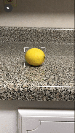
Item Recognition and Search


Oranges
Successfully
Recognized
Items Couldn't
Recognized


Item Search
Item Add
In iteration 1, we conducted user testing sessions with NCR employees. Our aim was to get an expert view and also make sure that our design also reaches normal visioned users. We asked our users to think aloud during the process to be able to understand the thoughts and emotions.
We received many positive feedbacks. They thought that the system was intuitive and innovative. Users were so excited about product recognition of the kiosk and eliminating the barcode scanning. They mentioned how they also had problems when they are scanning the barcodes. Even though pairing the phone with the kiosk interaction was new to our users, they really liked the idea.
Pairing the phone with the kiosk was a little unclear to our users. They had a hard time understanding wordings and icons. Feedbacks were not enough for them to understand the process and loading screens. During the tasks which required users to add products to their list most of our users tapped to the product picture instead of the "add button".
Iteration 2
In iteration 2, we made changes according to the feedback that we received. We used NCR's usability lab for our user testing. This allowed us to video record the interaction of our users and test our design by using the actual kiosk.
1. Accessibility
One of the most important features is to be able to control the accessibility setting by using the user's own phone. We analyzed the accessibility settings of Android and iOS and picked the ones that can be relevant to kiosk screens.
iOS layout and style tired to be preserved because we realized that most of the people with visual impairments are used to these layouts and can be confused when they encounter different styles.
Futhermore we kept the access to previous receipts feature.


2. 3D Map and Highlighting the Product's Location
The app allows our users to be able to see the 3D Map of the store and it also according to the user's shopping list it highlights the items' locations. The map can be zoomed in and adjusted.


3. AR Scanner
Our users really like the idea of being able to scan the products and obtain more information about items. We provided a white background and black text to increase the contrast.
4. Pairing Phone with Kiosk

Transfering the accessibility settings and items from phone to kiosk was a new interaction. Hence, users needed more information about how to pair. Instead of icons, we used actual kiosk and phone to make the steps more clear. We clarified the steps by changing the wording. The technology that been used to make this interaction mentioned (NFC).


4. Kiosk Screens
We redesigned the UI of the kiosk screens and added additional screens to increase the clarity. We analyzed the contrast ratio, text size, and fonts to make sure that it has AAA standards.
We designed matching pairing screens with phone screens. Futhermore, we used the user's name to make the interface more appealing. We added screens to the kiosk for accessibility features to make sure that people can access it even if they don't have their phones. We made the "shopping cart list" to be accessible from almost every screen.


User Testing
We conducted our final user testings in the NCR Usability Lab. It allowed us to observe our users without interfering with their behaviors. We asked our participants to complete several tasks and conducted After Task Questionnaire (ASQ). We recorded the voices of the kiosk and used them during the Wizard of Oz Technique. We didn't conduct a think-aloud procedure which allowed us to record the Task Completion Time. Furthermore, we counted the Number of Clicks and Task Success. At the end of all the tasks, we conducted System Usability Test (SUS). It enabled us to get more data and sometimes ask follow-up questions regarding their answers.
Participants
-
Experts from NCR
-
NCR employees who interacted with our design using glasses that simulate visual impairments
-
Users with visual impairments
Task Examples
"Let’s say you want to explore the store’s layout. Please show us how you would do that. Where are you currently located? "
"The app also lets you customize the accessibility settings of the kiosk. Please show us how you would change the font size. "
"You are ready to send your updated accessibility settings to the kiosk. Assume you are in front of the kiosk now. Please send your settings to the kiosk. "

Final Observations


Visual impairment simulation glasses
-
Even though we revised some wordings, some descriptions were still not clear to our users.
-
Users couldn't see some of the buttons or didn't know that buttons were clickable. Hence, the placement of some buttons and their designs should be revised.
-
Pairing the phone with the kiosk interaction was not clear to our users even though the feature was explained. We believe that it is because this interaction is new to our users.
-
Using the AR technology was not clear to our users. They didn't see it as an assistive technology hence, they failed to use it in many scenarios. The design implication that we came up with this problem is the novelty and the wording of "AR Scanner". There can be a clear and simple way of describing this feature.
-
Finding the accessibility settings by using the phone was hard for our users. These accessibility settings often caused confusion because of the tab called settings.
-
Users were wondering if they could obtain more information about the products by using the AR technology (ex.expiration date).
-
The green theme color caused confusion when it is used in certain situations. (ex. green color for a cancel button).
.png)